

- Joined
- Oct 12, 2023
- Posts
- 241
- Reaction score
- 67
Website navigation is the system that helps visitors move around a website, find information, and take the next step. For businesses, clear navigation can shape how people understand products, services, trust signals, and calls to action.
Let’s explore what website navigation is, how a site navigation bar works, when to use a mega menu and how it relates to navigation, and how to build a navigation that supports users, search engines, and AI discovery platforms. We’ll also cover website navigation trends and practical steps for planning a structure before making design changes.
Website navigation includes various elements like the links, menus, buttons, breadcrumbs, footer links, and page paths that help people explore a website and find relevant information faster. Those elements typically stay on all or most pages of the website. The most familiar part is the website navigation bar, often placed at the top of a page.
A navigation menu usually links to key pages such as Home, Services, Products, About, Blog, Contact, Pricing, or Support. On a small business website, the main menu might include Services, Pricing, About, and Contact Us.
Navigation also helps search engines and AI platforms understand how pages relate to each other. A clear structure shows which pages are most important, which topics belong together, and how users can move from broad information to specific actions.
A helpful place to start is a sitemap. A visual sitemap shows how pages connect, while an XML sitemap helps search engines discover URLs.
Website navigation affects three things: user experience, search visibility, and conversion paths.
If visitors cannot find what they need, they may leave before they read a service page, view a product, or complete a form. This is especially important for ecommerce websites, where product discovery depends on clarity and easy path to purchase. Baymard Institute’s 2025 ecommerce UX benchmark found that 58% of desktop sites and 67% of mobile sites had “mediocre” to “poor” homepage and category navigation performance.
Navigation also supports SEO. Search engines use internal links to discover pages and understand site hierarchy. A strong navigation structure can help important pages receive more internal link equity, while descriptive anchor text can give search engines more context.
LLMs (large language models) like ChatGPT and Gemini also give preference to clear structure. When pages are well organized, named clearly, and supported by internal links, AI tools can more easily interpret what the business does, where key information lives, and which pages answer specific questions.
Web design in 2026 is becoming more visual, more interactive, and more AI-assisted. Figma’s 2026 web design trends highlight experimental navigation, immersive elements, bold typography, motion design, dark mode, and AI-powered interfaces.
That does not mean every small business website needs a spinning 3D menu or a mystery drawer hidden behind a floating icon. For most business sites, clarity still wins. Experimental navigation can work for creative portfolios, campaigns, and brand storytelling, but service businesses, ecommerce stores, and local companies often benefit from familiar patterns.
A good rule of balance: use creativity in the visual layer, but keep the navigation logic simple. A visitor should know where to click without pausing to decode the menu like a puzzle box.
For visual references, explore inspiring examples of website navigation. For a more structured UX planning approach, Stanford’s guidance on designing website navigation explains how to organize content around user needs.
Source: Awwards.com
Many websites organize navigation around internal teams: Sales, Operations, Resources, Corporate, or Solutions. Visitors usually think in simpler terms: What do you sell? Can I trust you? How much does it cost? How do I contact you?
A better starting point is to list the top tasks a visitor wants to complete. For example, a fitness studio using movebetter.it.com might identify these tasks:
Those tasks can become menu items, page sections, or footer links. The navigation menu should reflect the visitor’s journey, not the company org chart.
Source: Unsplash
A top website navigation bar works best when it is easy to scan. For many small business websites, five to seven top-level items are enough. More than that can make the menu feel crowded, especially on mobile.
Short labels usually work better than clever ones. “Services” is clearer than “What We Do.” “Pricing” is clearer than “Plans for Every Journey.” Personality can live in the page copy. Navigation labels need to act like signs in an airport: useful first, charming second.
Common top-level items include:
A bakery using sweetcrumbs.it.com might choose: Menu, Custom Cakes, Catering, Gallery, About, Contact. An IT consultant using securepath.it.com might choose: Services, Industries, Case Studies, Pricing, Resources, Contact.
A mega menu is a large dropdown menu that displays many links in grouped sections. It can be useful for ecommerce stores, education sites, SaaS businesses, marketplaces, and content-heavy websites.
A mega menu is usually helpful when a standard dropdown becomes too long or when users need to compare categories quickly. For example, an online homeware store using homeedit.it.com might group its mega menu into Furniture, Kitchen, Lighting, Decor, Sale, and Buying Guides.
A simple structure may look like this:
Shop
Furniture: Sofas, Tables, Storage, Beds
Kitchen: Cookware, Tableware, Small appliances
Decor: Rugs, Mirrors, Wall art, Candles
Helpful links: New arrivals, Best sellers, Gift cards
For usability, a mega menu should not become a wall of blue links. Group items under clear headings, use plain labels, and keep the number of options manageable. A practical target is 3 to 6 columns, with 4 to 8 links in each group. If a menu needs more than that, the site may need cleaner categories or stronger filtering.
On mobile, a mega menu should become a simple layered menu, accordion, or category list. Hover-based menus can be difficult on touchscreens, so taps need to work cleanly.

Source: Pexels
Breadcrumbs show where a page sits within the site structure. They often look like this:
Home > Services > Website Design > Ecommerce Website Design
Breadcrumbs are useful for ecommerce sites, blogs, knowledge bases, and websites with nested service pages. They help visitors move back to broader categories without relying on the browser back button.
They also support search engines by making page relationships easier to understand. For example, a product page on urbanplants.it.com could sit under Home > Indoor Plants > Low-Light Plants > Snake Plant.
Breadcrumbs should support the main navigation, not replace it. They work best as a quiet guide near the top of the page.
Navigation is not only about moving around. It also helps visitors take meaningful actions, such as booking, buying, subscribing, calling, or requesting a quote.
A service business may include a “Get a Quote” button in the top navigation. An ecommerce store may highlight Cart, Account, Search, and Sale. A course provider may add “Enroll” or “Book a Demo.”
The key is to match the call to action to the page purpose. A landing page may use simpler navigation than a full website because it often focuses on one campaign goal. An ecommerce site may need richer navigation to help shoppers compare products and enhance conversions.
The menu should support action without shouting over the content. One clear button is often stronger than four competing buttons.
Mobile navigation deserves its own review. A menu that works on desktop can become cramped, hidden, or awkward on a phone.
Common mobile navigation patterns include:
For ecommerce websites, product categories should be easy to access from the mobile menu. Baymard’s research notes that mobile users rely on main navigation to understand the catalog and find products.
Tap targets should be large enough to press comfortably. Menu links should have enough spacing, and the search function should be visible for larger catalogs. If a user needs thumb gymnastics to open a submenu, the design may need a calmer layout.

Source: Awwards.com
Website navigation should not be treated as a one-time setup. Business priorities change, products change, and users may look for different information over time.
Useful data sources include:
If many users search for “returns,” “pricing,” “shipping,” or “consultation,” those topics may deserve a clearer place in the navigation menu. If an important service page gets little traffic, it may be buried too deep.
This is also where prompts can help. A business owner could ask an AI tool:
“Review this website navigation structure for a small business selling handmade candles on glowcraft.it.com. Suggest clearer menu labels, missing pages, and a simple mega menu if needed.”
Or:
“Create a navigation menu for a local dental clinic website on brightsmile.it.com. Keep it simple for mobile users and include service, trust, and booking pages.”
AI can generate useful ideas, but the final structure should still reflect real users, real products, and real business goals.
Source: Unsplash
Start by writing down all existing and planned pages. Include service pages, product categories, blog categories, contact pages, policy pages, and support content.
Put pages into clear groups. For example: Products, Resources, Company, Support. This helps reveal whether the site needs a simple navigation bar, dropdowns, or a mega menu.
Select the pages or categories that matter most to users and the business. Keep the top navigation focused. Move less important links to the footer.
Use familiar labels that people understand quickly. Avoid internal jargon, vague wording, or labels that sound creative but unclear.
Plan how the menu will behave on desktop, tablet, and mobile. If the site uses a mega menu, create a simpler mobile version using expandable sections.
Source: Awwards.com
Add breadcrumbs, footer links, related page links, and search where useful. For larger sites, review whether a blog, store, or knowledge base needs a separate structure. If sections need their own environment, review the basics of subdomain setup before creating addresses such as shop.example.it.com or support.example.it.com.
Ask people unfamiliar with the website to complete simple tasks, such as finding pricing or booking a call. Review the feedback and address pain points.
Website navigation helps visitors understand where they are, where they can go, and what action they can take next. A clear website navigation bar, simple navigation menu, well-planned mega menu, and useful breadcrumbs can make a site easier to use for people, search engines, and AI platforms.
For small businesses, the best navigation is not always the most inventive. It is the one that helps visitors find what they came for with fewer clicks, and less moments of confusion.
Navigation in a website is the system of menus, links, buttons, breadcrumbs, and page paths that helps visitors move around. It usually includes the main website navigation bar, footer links, dropdowns, search, and internal links between related pages.
Four common types of website navigation are main navigation, footer navigation, breadcrumb navigation, and sidebar or contextual navigation. Main navigation shows the most important pages, footer navigation holds useful secondary links, breadcrumbs show page hierarchy, and contextual navigation connects related content.
To make navigation in a website, list your key pages, group them into clear categories, choose five to seven main menu items, write short labels, and design versions for desktop and mobile. Then add supporting links such as breadcrumbs, footer links, and search if the site has many pages.
An example of navigation in a website is a top menu with links such as Home, Services, Pricing, About, Blog, and Contact. On an ecommerce site, the navigation menu might include Shop, New Arrivals, Best Sellers, Sale, Size Guide, Account, and Cart.
Website navigation is very important because it affects how easily visitors find information, how search engines understand the site, and how smoothly users move toward actions such as buying, booking, or contacting the business. Poor navigation can make even a strong website feel confusing.
Want to make your website work harder for you? Visit it.com Domains blog and follow us on social media.
Continue reading at the it.com Domains blog...
Let’s explore what website navigation is, how a site navigation bar works, when to use a mega menu and how it relates to navigation, and how to build a navigation that supports users, search engines, and AI discovery platforms. We’ll also cover website navigation trends and practical steps for planning a structure before making design changes.
What Is Website Navigation?
Website navigation includes various elements like the links, menus, buttons, breadcrumbs, footer links, and page paths that help people explore a website and find relevant information faster. Those elements typically stay on all or most pages of the website. The most familiar part is the website navigation bar, often placed at the top of a page.
A navigation menu usually links to key pages such as Home, Services, Products, About, Blog, Contact, Pricing, or Support. On a small business website, the main menu might include Services, Pricing, About, and Contact Us.
Navigation also helps search engines and AI platforms understand how pages relate to each other. A clear structure shows which pages are most important, which topics belong together, and how users can move from broad information to specific actions.
A helpful place to start is a sitemap. A visual sitemap shows how pages connect, while an XML sitemap helps search engines discover URLs.

Why Website Navigation Matters for Business Websites
Website navigation affects three things: user experience, search visibility, and conversion paths.
If visitors cannot find what they need, they may leave before they read a service page, view a product, or complete a form. This is especially important for ecommerce websites, where product discovery depends on clarity and easy path to purchase. Baymard Institute’s 2025 ecommerce UX benchmark found that 58% of desktop sites and 67% of mobile sites had “mediocre” to “poor” homepage and category navigation performance.
Navigation also supports SEO. Search engines use internal links to discover pages and understand site hierarchy. A strong navigation structure can help important pages receive more internal link equity, while descriptive anchor text can give search engines more context.
LLMs (large language models) like ChatGPT and Gemini also give preference to clear structure. When pages are well organized, named clearly, and supported by internal links, AI tools can more easily interpret what the business does, where key information lives, and which pages answer specific questions.
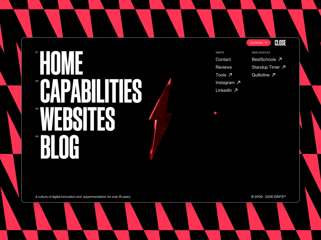
Website Navigation Trends
Web design in 2026 is becoming more visual, more interactive, and more AI-assisted. Figma’s 2026 web design trends highlight experimental navigation, immersive elements, bold typography, motion design, dark mode, and AI-powered interfaces.
That does not mean every small business website needs a spinning 3D menu or a mystery drawer hidden behind a floating icon. For most business sites, clarity still wins. Experimental navigation can work for creative portfolios, campaigns, and brand storytelling, but service businesses, ecommerce stores, and local companies often benefit from familiar patterns.
A good rule of balance: use creativity in the visual layer, but keep the navigation logic simple. A visitor should know where to click without pausing to decode the menu like a puzzle box.
For visual references, explore inspiring examples of website navigation. For a more structured UX planning approach, Stanford’s guidance on designing website navigation explains how to organize content around user needs.
Source: Awwards.com
7 Best Practices to Improve Website Navigation
1. Start with user goals, not company departments
Many websites organize navigation around internal teams: Sales, Operations, Resources, Corporate, or Solutions. Visitors usually think in simpler terms: What do you sell? Can I trust you? How much does it cost? How do I contact you?
A better starting point is to list the top tasks a visitor wants to complete. For example, a fitness studio using movebetter.it.com might identify these tasks:
- View classes
- Check prices
- Meet instructors
- Book a session
- Read reviews
- Find the studio location
Those tasks can become menu items, page sections, or footer links. The navigation menu should reflect the visitor’s journey, not the company org chart.
Source: Unsplash
2. Keep the website navigation bar short and clear
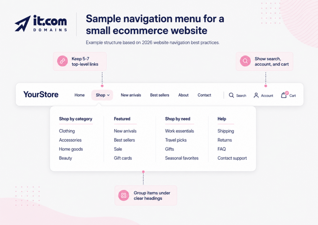
A top website navigation bar works best when it is easy to scan. For many small business websites, five to seven top-level items are enough. More than that can make the menu feel crowded, especially on mobile.
Short labels usually work better than clever ones. “Services” is clearer than “What We Do.” “Pricing” is clearer than “Plans for Every Journey.” Personality can live in the page copy. Navigation labels need to act like signs in an airport: useful first, charming second.
Common top-level items include:
- Home
- Services
- Products
- Pricing
- About
- Blog
- Contact
A bakery using sweetcrumbs.it.com might choose: Menu, Custom Cakes, Catering, Gallery, About, Contact. An IT consultant using securepath.it.com might choose: Services, Industries, Case Studies, Pricing, Resources, Contact.
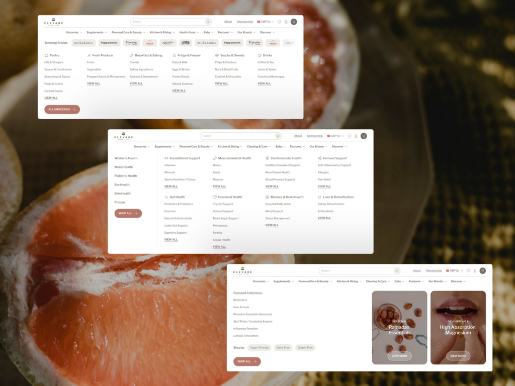
3. Use a mega menu only when the site needs it
A mega menu is a large dropdown menu that displays many links in grouped sections. It can be useful for ecommerce stores, education sites, SaaS businesses, marketplaces, and content-heavy websites.
A mega menu is usually helpful when a standard dropdown becomes too long or when users need to compare categories quickly. For example, an online homeware store using homeedit.it.com might group its mega menu into Furniture, Kitchen, Lighting, Decor, Sale, and Buying Guides.
A simple structure may look like this:
Shop
Furniture: Sofas, Tables, Storage, Beds
Kitchen: Cookware, Tableware, Small appliances
Decor: Rugs, Mirrors, Wall art, Candles
Helpful links: New arrivals, Best sellers, Gift cards
For usability, a mega menu should not become a wall of blue links. Group items under clear headings, use plain labels, and keep the number of options manageable. A practical target is 3 to 6 columns, with 4 to 8 links in each group. If a menu needs more than that, the site may need cleaner categories or stronger filtering.
On mobile, a mega menu should become a simple layered menu, accordion, or category list. Hover-based menus can be difficult on touchscreens, so taps need to work cleanly.
Source: Pexels
4. Add breadcrumbs for deeper pages
Breadcrumbs show where a page sits within the site structure. They often look like this:
Home > Services > Website Design > Ecommerce Website Design
Breadcrumbs are useful for ecommerce sites, blogs, knowledge bases, and websites with nested service pages. They help visitors move back to broader categories without relying on the browser back button.
They also support search engines by making page relationships easier to understand. For example, a product page on urbanplants.it.com could sit under Home > Indoor Plants > Low-Light Plants > Snake Plant.
Breadcrumbs should support the main navigation, not replace it. They work best as a quiet guide near the top of the page.
5. Connect navigation to conversion paths
Navigation is not only about moving around. It also helps visitors take meaningful actions, such as booking, buying, subscribing, calling, or requesting a quote.
A service business may include a “Get a Quote” button in the top navigation. An ecommerce store may highlight Cart, Account, Search, and Sale. A course provider may add “Enroll” or “Book a Demo.”
The key is to match the call to action to the page purpose. A landing page may use simpler navigation than a full website because it often focuses on one campaign goal. An ecommerce site may need richer navigation to help shoppers compare products and enhance conversions.
The menu should support action without shouting over the content. One clear button is often stronger than four competing buttons.
6. Make mobile navigation simple
Mobile navigation deserves its own review. A menu that works on desktop can become cramped, hidden, or awkward on a phone.
Common mobile navigation patterns include:
- A hamburger menu
- A sticky bottom bar
- Expandable category lists
- A visible search icon
- Account and cart icons for ecommerce
For ecommerce websites, product categories should be easy to access from the mobile menu. Baymard’s research notes that mobile users rely on main navigation to understand the catalog and find products.
Tap targets should be large enough to press comfortably. Menu links should have enough spacing, and the search function should be visible for larger catalogs. If a user needs thumb gymnastics to open a submenu, the design may need a calmer layout.
Source: Awwards.com
7. Review analytics and search data regularly
Website navigation should not be treated as a one-time setup. Business priorities change, products change, and users may look for different information over time.
Useful data sources include:
- Google Analytics reports for top pages and user paths
- Google Search Console queries
- Site search terms
- Heatmaps and click maps
- Customer support questions
- Sales team feedback
If many users search for “returns,” “pricing,” “shipping,” or “consultation,” those topics may deserve a clearer place in the navigation menu. If an important service page gets little traffic, it may be buried too deep.
This is also where prompts can help. A business owner could ask an AI tool:
“Review this website navigation structure for a small business selling handmade candles on glowcraft.it.com. Suggest clearer menu labels, missing pages, and a simple mega menu if needed.”
Or:
“Create a navigation menu for a local dental clinic website on brightsmile.it.com. Keep it simple for mobile users and include service, trust, and booking pages.”
AI can generate useful ideas, but the final structure should still reflect real users, real products, and real business goals.
Source: Unsplash
Step-by-step Process for Setting Up Website Navigation
Step 1: List every important page
Start by writing down all existing and planned pages. Include service pages, product categories, blog categories, contact pages, policy pages, and support content.
Step 2: Group related pages
Put pages into clear groups. For example: Products, Resources, Company, Support. This helps reveal whether the site needs a simple navigation bar, dropdowns, or a mega menu.
Step 3: Choose top-level menu items
Select the pages or categories that matter most to users and the business. Keep the top navigation focused. Move less important links to the footer.
Step 4: Write short labels
Use familiar labels that people understand quickly. Avoid internal jargon, vague wording, or labels that sound creative but unclear.
Step 5: Design desktop and mobile versions
Plan how the menu will behave on desktop, tablet, and mobile. If the site uses a mega menu, create a simpler mobile version using expandable sections.
Source: Awwards.com
Step 6: Add supporting navigation
Add breadcrumbs, footer links, related page links, and search where useful. For larger sites, review whether a blog, store, or knowledge base needs a separate structure. If sections need their own environment, review the basics of subdomain setup before creating addresses such as shop.example.it.com or support.example.it.com.
Step 7: Test and improve
Ask people unfamiliar with the website to complete simple tasks, such as finding pricing or booking a call. Review the feedback and address pain points.
Website navigation helps visitors understand where they are, where they can go, and what action they can take next. A clear website navigation bar, simple navigation menu, well-planned mega menu, and useful breadcrumbs can make a site easier to use for people, search engines, and AI platforms.
For small businesses, the best navigation is not always the most inventive. It is the one that helps visitors find what they came for with fewer clicks, and less moments of confusion.
FAQs
What is navigation on a website?
Navigation in a website is the system of menus, links, buttons, breadcrumbs, and page paths that helps visitors move around. It usually includes the main website navigation bar, footer links, dropdowns, search, and internal links between related pages.
What are the 4 types of navigation?
Four common types of website navigation are main navigation, footer navigation, breadcrumb navigation, and sidebar or contextual navigation. Main navigation shows the most important pages, footer navigation holds useful secondary links, breadcrumbs show page hierarchy, and contextual navigation connects related content.
How to make navigation on a website?
To make navigation in a website, list your key pages, group them into clear categories, choose five to seven main menu items, write short labels, and design versions for desktop and mobile. Then add supporting links such as breadcrumbs, footer links, and search if the site has many pages.
What is an example of navigation in a website?
An example of navigation in a website is a top menu with links such as Home, Services, Pricing, About, Blog, and Contact. On an ecommerce site, the navigation menu might include Shop, New Arrivals, Best Sellers, Sale, Size Guide, Account, and Cart.
How important is website navigation?
Website navigation is very important because it affects how easily visitors find information, how search engines understand the site, and how smoothly users move toward actions such as buying, booking, or contacting the business. Poor navigation can make even a strong website feel confusing.
Want to make your website work harder for you? Visit it.com Domains blog and follow us on social media.
Continue reading at the it.com Domains blog...
